CSS Animations are Probably Magic
1067 words. Time to Read: About 10 minutes.Stop what you are doing right now and listen to me because CSS animations are actual magic and are amazing.
Now that I’ve got your attention, let me explain myself a little more coherently. If you’ve read many of my other posts you’re probably thinking, “Wait a minute. You post about Python and Ruby and back-end languages and scripting. What’s all this front-end nonsense?” To which I reply, with great affront, “Nonsense?! Your face is nonsense. The people who do front-end things are geniuses (Genii? Genies?) that make our world look pretty and make our user experiences streamlined, and other things that I take for granted and don’t even know about. But even still, CSS animations are magical enough that they should be shared with all, not just one lucky subset.” So, what follows will be a introduction and guide that should get even the grumpiest sysadmin to a point where they feel comfortable animating with CSS all on their own.
Let’s begin.
The Background
CSS. It’s a language. It’s scary, maybe, for some. A lot of times, for me, it ends up looking more like a wishlist of how I want my page to look rather than a well-planned and crafted stylesheet. To guarantee that we’re all starting at the same place, I’m going to sprint through the very basics. Things you should know before moving on:
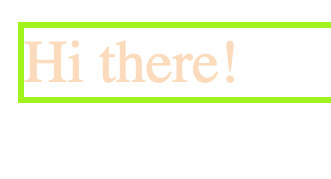
- HTML is a markup language used to layout web pages. It looks like this.
<div>Hi there!</div>
- CSS is used to dictate how your website should look. It looks like this:
div {
    color: peachpuff;
    font-size: 20px;
    border: 2px solid chartreuse;
}
- You’ll note that I specify what
elementgets targeted for these styles at the beginning. I’m targeting mydivfrom above. (Don’t worry. Adivis just a container/box.) The webpage would now look like this:
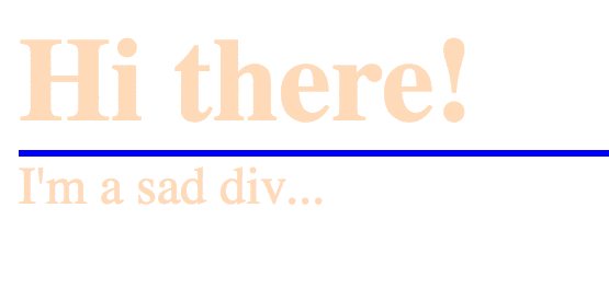
- You can get more specific with targeting your elements by adding classes and ID’s to your elements.
<div class="underlined" id="main-div">Hi there!</div>
<div>I'm a sad div...</div>
- You can access these classes and ID’s from within your CSS like this.
div {
    color: peachpuff;
}
.underlined {
    border-bottom: 2px solid blue;
}
#main-div {
    font-size: 36px;
    font-weight: bold;
}
The final product will end up looking like this:
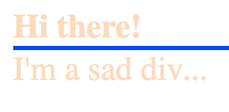
Note how the main div gets all three style improvements, but both divs get the color, because the div section targets everything it applies to.
OK! That should get us up to speed. There are a few more things than that that allow us to get more complicated, but I’m going to leave that alone for now.
A Note
As we continue, it should be known that not all browsers currently support some of the animation CSS. I highly recommend using a site or tool like this AutoPrefixer to generate the relevant vendor prefixes that will allow all of this to work in more browsers. Copy/paste your generic CSS into the input window, run the autoprefixer, and copy the output css to the file that you reference in your HTML document. Or use a tool that does all of this for you, if you’re a fancy pants.
Let’s Get to Animations
As it turns out, you can animate a lot of things a lot of different ways. Let’s start simple and go from there.
The Simple Way: Transitions
Transitions are a way of switching your changes on and off, simulating animations quasi-manually. There are several pseudo-selectors that you can use to apply styles based on what the user is doing. Try this, continuing with the HTML we had before.
/* ... */
div:hover {
    background: #111;
    color: #CCC;
}
Cool right? However, for those of you with an eye for design, you might complain that the transition is a bit abrupt and clunky. All we have to do is add one line!
div {
    color: peachpuff;
    transition: background 1s ease-in, color 1s ease-in;
}
And it smoothly transitions! Cool right? But we want more control! We want animations to happen without hover! We. Want. Keyframes!
Keyframes
Keyframes are where the money is at. You just specify what changes you want made throughout the animation, with values from 0% to 100%. You can also replace 0% with “from” if you like, and 100% with “to”. Up to you.
@keyframes flip-flop {
  0% {
    transform: rotate(0deg);
    top: 0%;
  }
  40% {
    transform: rotate(180deg);
    top: 50%;
  }
  60% {
    transform: rotate(180deg);
    top: 50%;
  }
  100% {
    transform: rotate(360deg);
    top: 0%;
  }
}
One thing to note is that my 40% and 60% are the same. That’s because I want my div to pause in its motion for part of the duration. As you can see, all I did was specify the what the attributes should be throughout the animation. The browser should fill in the rest. To attach this animation to your div, insert the following:
#main-div {
  font-size: 36px;
  font-weight: bold;
  position: absolute;
  animation: flip-flop 3s infinite;
}
Note that I added a position: absolute to increase wow factor. The key line is the animation line. You specify the name of the keyframe animation to use, how long, and how many times. There are a lot more settings that you can use as well. Let’s take a look.
Ok there main-div, calm yourself down. Stop showing off. One thing, sometimes shapes get weird as they get animated in Firefox. If that happens to you, just add outline: 1px solid transparent.
Wrap Up
And that’s it! You’re well on your way to CSS animation mastery. Soon you’ll be animating SVG’s (not very different than this), buttons, and more! If you’ve made some cool stuff like this, share! Or, if you have some tips on how to do this better/cooler/more performantly, also let me know. This tutorial on Tutsplus is a really fun tutorial that you should do right now after reading this article. To see more cool/inspiring/disgustingly amazing things, you should sign up for the CodePen newsletter. I don’t even really do much on there, but the weekly newsletter makes me so happy.
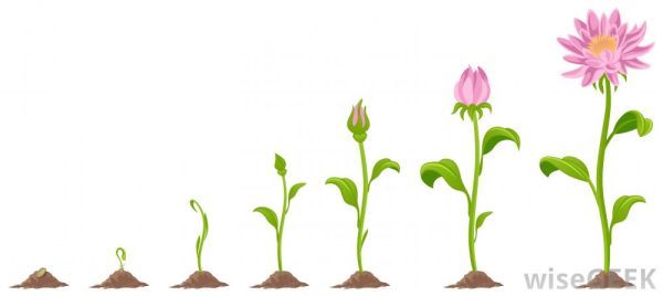
Cover image credit: WiseGeek.org
Author: Ryan Palo | Tags: html css front-end animations | Buy me a coffee
Like my stuff? Have questions or feedback for me? Want to mentor me or get my help with something? Get in touch! To stay updated, subscribe via RSS